Gig posters


artists will often speak of channeling, of receiving something from beyond themselves. what gets less attention is the transduction that follows. energy arrives as feeling, as unconscious knowing, and then moves through the body, through every experience and instinct that has ever been. it is through this process that we arrive at the output we recognize as creation. we are not the windows light passes through, but rather the prisms that expose its color and brilliance.
there is a form of expertise that has nothing to do with formal training. it comes from something closer to devotion: the ability to know what good feels like before being able to explain why, and the willingness to sit with something and chisel away until a mirror is revealed. that is a different and equally valid form of mastery.
some distances aren't about the miles. they're about the decision behind them, made on instinct rather than calculation, where the act of taking action proves what planning never could: that feeling can be trusted as much as logic. not because the destination or the outcome is necessarily better, but because the leap itself reveals a capacity for self-trust that most people never test.
indecision is rarely the absence of a preference. somewhere beneath the noise of opinions and the fear of being wrong, there is already a direction. most people can feel it, even when they refuse to name it. the hard part is not figuring out what to do. it is finding the nerve to admit that you already know.
most social products are built around ephemerality. click and scroll until you (maybe) find something interesting, move on. prompting people is built around the opposite instinct: sitting still as a feature, not a flaw.
the core mechanic is simple. one prompt at a time. written by humans for humans. you write your response before you can read anyone else's. the feed only opens after you've contributed something unique to you.
prompting people is a space where the act of writing before reading restores something that most platforms have mechanistically eroded.
in the final stages of development.
while the lyla minor work was collaborative, arranged, negotiated, this project is more exposed. what started as a fragmented labor of love has slowly taken shape into a story that wants to be told.
no title yet, no release date beyond 2026. ~13 songs, welcomed and nurtured as they arrive.
2024 –
Lead Designer
NumberOne AI
Leading brand, website, and marketing design for WethosAI and NumberOne AI, shipping AI-forward websites and campaigns built from scratch. Leveraging emerging tools and systems to move fast, experiment boldly, and define the company's creative edge.
2021 – 24
Designer / Marketing Lead
Cascade Mountain Tech
Led brand, website, and marketing design across digital and social channels. Expanded from an initial website and brand refresh into broader creative direction. Produced infographics, marketing assets, and merchandising that amplified reach and strengthened the company's visual presence.
Aug '23
Brand Designer (contract)
Coastline Custom Cabinetry
Worked closely with the client to identify the core pillars of their business. Translated those insights into a new brand identity and a newly designed website.
2020 – 21
Brand Designer (contract)
SIPNSAND
Strategized key brand elements including company color systems and typeface selection. Created a comprehensive style guide used in presentations to potential investors. Designed multiple exterior concepts for company vans.
Jun '19
Marketing / Design Intern
Ripl, Inc.
Created digital content supporting the launch of a new webpage and iOS app. Collaborated with the UX/UI team to help troubleshoot and refine app functionality.
2016 – 20
BA Digital Design
Seattle University
I'm building a personal portfolio site. It needs a typography overhaul, color refinement, and overall polish. I also need help thinking through deployment.
Can I view it in my browser?
Update the project name to WethosAI. Update The Last Questions description. Adjust the other copy throughout.
Nope, now we're back to the old colors.
I'm more into neutral color palettes.
The grey needs to be more noticeable.
Okay and go back to how the background was before you made that more grey.
Try Barlow Condensed for the display font.
I strongly dislike Barlow.
Try League Gothic.
Revert all the font changes. Go back to what we had.
Look through all the copy and make sure we're not using any em dashes.
When I hover over the copy and explanation for each project, it causes some of the text to readjust.
I want it to the left of my name and location, with proper spacing and a little larger.
Actually remove it, it's not necessary.
The animations across the board feel a little over the top. Let's make it a bit more rigid and sturdy.
Still not loving the animations.
Find a modern, unique approach that will give a viewer joy with subtlety.
That's interesting but it could be a bit sharper.
I don't like this. Find a different, more zen approach.
I don't like how it loads sequentially from top to bottom. I want everything to load at once.
Okay let's extend the lines that separate the projects and albums full width.
Now the view and listen buttons are too far away. Let's position those to the right of the title.
The labels need to live to the right of the title for each.
The text sizing needs to be the same for each album and design project. The design project looks bigger and I prefer that.
Okay now let's make both slightly smaller.
The listen or view tags should sit vertically centered with each title they represent and only slightly more to the right. Think of it like a pill label.
Okay and I don't want The Last Questions to be greyed out.
Make it so there's the slight horizontal hover slide on the debut solo album and remove the numbers from the left side of the design projects.
On mobile, the images for the albums and the projects look awkwardly small.
Okay and then we need to increase the size of my name in the bottom left for mobile breakpoints and move the email and LinkedIn elsewhere. Maybe delete the LinkedIn altogether.
Make sure on those sentences there are no orphan lines of text, ever.
I live in Long Beach, not Irvine.
Hide the email link on the home page for mobile.
The full descriptions in the I am section could be larger across all three on mobile.
They look the same. I was referring to the full sentences that sit at the top of each page.
SLIGHTLY smaller.
Split the difference.
Can we make it so the music one is two lines without reducing the size?
Revert that change. I don't like it.
Here are the two released albums. [Apple Music links for Lyla Minor EP and Intermezzos Vol. 1]
Band name: Lyla Minor. Year 2024 for both.
You can't pull the album imagery?
Perfect. Now make sure to include the dash in the name of the projects to separate the title from EP.
Update the design sentence. Update the music sentence.
I am lovingly (and endlessly) in search of what it's not.
1,200 miles → 1,200 miles from home → Magic is revealed → A believer in magik.
My name in the bottom left looks too small on some of the mid to larger breakpoints.
Particularly between 640px wide and 1500px wide.
Should be ever so slightly smaller.
A believer in magik → Pro magik.
Okay, so I want to actually try to mix this up a little bit. I really like the look and the flow of the site so far, but as I stepped away and then I revisited it, I'm kind of thinking that the initial home page that's broken up into design, music, and me is not what I want. I don't want it. I actually really like how it looks. Instead of just having those three categories, I actually think we should have every project, album, and personal segment from the I am section. I guess we could call it a thought, and we should have those in a scrollable, sort of vertical thing. I'm going to give you a website that does something similar that I'm inspired by.
Now I don't like this change. I actually wanted to keep the look of the home page with the large words. Instead of having design, those would be the words of the project, like the last questions, Lyla Minor EP, Pro magik. They would have little labels articulating what they are, like design, thought, or music, and they would be organized in more of a timeline. Think of it like a vertical timeline that you could scroll through. I want to keep my name, the location, and the email at the bottom like it was before. I don't like how you changed so many things. I did not want that at all. Let's start there.
Okay, and now the order, starting from oldest to newest, should be: 1,200 miles from home, Lyla Minor, Intermezzos Volume One, NumberOne AI, Pro magik, WethosAI, The Last Questions, Debut Solo Album.
On mobile, let's move the label pills so that they are actually rotated 90 degrees, so that they are sort of sideways. I want to put them to the left side of each of the items so that there is more room for the titles to extend. I don't want the titles to be two lines on mobile. I want them to be one line.
Okay, that's actually really ugly. Let's remove the pill labels entirely on mobile, and let's still make sure that the titles only are on one line, but let's make them as big as we can, with the knowing that we want that still to be the constraint.
None of the letters are getting cut off. I see the G in Pro magik getting cut off, but while we're looking at that, there are other things that are getting cut off too, so we need to make that change. I want to change the title of Pro magik to Magic is earned.
No, I didn't want you to remove it. I just wanted you to remove the words "from home" from that title. Please add it back and make the appropriate change on the title.
Let's adjust the order, going from oldest to newest but keeping it so the newest is at the top. Starting with oldest, it should be: Intermezzos Vol. 1, 1,200 miles, Lyla Minor EP, NumberOne AI, Magic is earned, Those Say I debut solo album, The Last Questions. And then what happens to the anti-expert? That should be in there too, and it should be, honestly, at the top.
Oops, you did those in the wrong order. I wanted the newest to be on top.
Do not show the copy beneath the thoughts. It should either take you to a separate page or it should open up as a drawer beneath it to show the copy. I would probably prefer a new page and have the copy be centered so that it almost looks like Substack.
Okay, and somewhere along the line, we lost the debut solo album, and WethosAI got turned to Those Say I.
Let's add some cool stylization to the ones that are in progress, aka The Last Questions and Debut Solo Album. Maybe some yellow tape that says "in progress" or something clever like that, just something that looks cool visually and adds a touch of character to this.
No, put it over the title itself. And can you make it look a little more three-dimensional or something? Just, this looks really boring.
Okay, that's better, but instead of making it take up the full width of the screen, just make it go over the title itself. The text.
Okay, and then for all of them, I think "in progress" should be centered within the little banner.
Can we make it look like the classic black and white striped warning tape and then have the in progress text be white on top of that? Keeping the same three-dimensional vibe.
Let's revert that change. I don't like that.
Maybe instead of the banner, we just put a horizontal line through them. More minimal and subtle. And the line can be black, the same color as the other active titles.
Actually, I take it back. Make it the same color as the text itself and make it a little bit thicker.
You know what, better yet, put both of these two at the top, and you can put The Last Questions at the very top. Instead of the line through them, what I want you to do is imagine that the text itself is making up a loading bar. Don't put a shape, a square, behind the text. Literally just imagine that the text itself is a loading bar, and then I want you to display visually that The Last Questions are about 85% done and the Debut Solo Album is about 70% done. Just visually.
Okay, but there still needs to be a visual separation between that and the rest of the stuff. It shouldn't be black at all. It should be that gray, and where it hasn't completed yet would be a lighter gray.
Nice, and let's actually make the Debut Solo Album like 74% done.
Okay, ignore the percentage. I want it to look similar to The Last Questions in the sense that the loading bar is part way through a letter. It's not a clean break, and then I want The Last Questions to be a little bit further along, closer to complete.
Okay cool and then I think next to both of them let's put some subtle futuristic-looking loading animations. Make it look really slick and just not too over the top but just something kind of cool to the right of them.
Okay. Next, I want to add a new item to our primary list, and I want it to be called "change log". What I want you to do is go back and scour over the entire chat history for this project so far. I want you to just make a big compilation of all the prompts that I have told you. This is going to be sort of like a normal change log. It's literally just going to be a massive list of every prompt I've done, and I want to continue to do it going forward, including this prompt too. I want this to just be a record over time of every word that I've spoken that has ended up creating this site, and I actually want there to be a word count at the top.
Newest at the top.
How do I ensure that each one of these prompts from here on out, including the one I just did, gets added to the changelog? I literally want everything I say to you to be added to this changelog if we're working on this project. Also make changelog one word.
There is no way we can automate it so I never have to say that to you.
Let's allow people to click into the last questions and debut solo album and read a bit about what those projects are.
For the Lyla Minor EP and the Intermezzos Volume 1 EP, let's create the option for people to choose whether they want to hear it on Spotify or Apple Music and then go and find the links for it for Spotify. Include both of those so that it actually works if they want to click Spotify.
https://open.spotify.com/album/24py69B0xZhT1V27lXv8us & https://open.spotify.com/album/0BDZT0rTYIAtGlzGr10YDl
I don't want it to take you to a separate page. I actually want those two buttons, with a cool animation, to sort of replace the title of the EP in that same horizontal bar that the title lives in. The same goes for the other EP.
Okay great. Let's move the changelog to the bottom of the list.
Let's use sentence case for debut solo album.
Let's make sure the slash between Apple Music and Spotify is vertically centered with the text.
Okay, and then let's use that same paradigm for WethosAI and NumberOne AI. Instead of the two options, it'll be website and then my role. For my role, it'll use the same paradigm as the thought posts and just sort of explain my role at the company. Same with NumberOne AI.
Okay that's enough for tonight. Can you help me create a new repo on GitHub and push this? Just let me know what you need for me in terms of the GitHub credentials and I would be happy to set up the GitHub MCP if that makes things easier.
personal site, private for now
i want to try using die grotesk font across the site. I added it to the project folder (trial versions). we need to keep the sme text sixing and hiearchy as much as we can (bold and big on the home titles, minimal with small text, etc). let's try it out
let's create more spacing between the letters and try all caps for the primary items in the list, maybe use title caps for my name
okay now let's tighetn up the sapcing with both
i don't like these changes let's revert back to what we had before i added the new fonts
let's remove the labels and animated icons from each item, for any breakpoint
make the animation that displays the apple / spotify or website / my role smoother. right now it feels a bit jagged
okay now change "My role" to "Role"
make my name title case instead of all caps
i decided i don't like the loading bar for the top two entires. let's make them all the lighter grey color
okay aybe that'sa bit too light
Okay, that's great. Now let's tighten up the spacing on the name and make it one step bolder.
description for NumberOne AI role: I joined as a designer with a visual and digital merchandising background. Over two years the role has evolved significantly. What began as graphic design work has grown into conception, design, and execution of digital experiences end to end, using AI tools to compress what would typically require a team into a single focused point of view. The core value I provide is intuition. The ability to walk into a problem, feel whether something has soul, and build toward that. That instinct, combined with the ability to execute independently, is what I bring to every project. The role has been a genuine education in building things that work, operating inside real constraints with a CEO whose vision is worth being close to. Two years in, it has clarified exactly what kind of work I want to be doing next.
for wethos: WethosAI is an enterprise cognition platform built around interpersonal intelligence and behavioral science. A complex product with a lot of ideas competing for primacy, requiring a brand that could make all of it feel grounded rather than explained. Responsible for the full visual identity, design system, typography, color, art direction, copywriting, and custom web build. Developed in close collaboration with the CEO and brought to life independently across every layer of execution. / and new one for numberone: NumberOne AI operates at the intersection of science, engineering, and design, building intelligent systems across healthcare, security, and enterprise AI. The brand needed to carry that ambition without tipping into abstraction. Concepted and executed the full identity and web presence: visual language, design system, art direction, copywriting, and custom web build. Developed in close collaboration with the CEO from concept through launch.
are we not putting lines spaces between paragraphs?!
i don't like the font we're using for Long Beach and anywhere else it's used. let's find a replacement that achieves a similar subtlely but isn't as overused
let's see it
nope i don't like it, try the next one
that's better, what's the other
yeah
this looks the same as the first one
sure let's try it. something that pairs nicely with our main font
that's kinda cool. we'll need it a bit larger tho
this font is close but it's not the one. let's keep looking. this is for the smaller secondary font we just changed
you pick
nope. next
also no
still not right! look for something truly retro
what about something retro apple? not feeling ibm
second option
we need a better, more unique font for Long Beach and every other text element with that style
we need to find a better font for the long beach text and any other texts with that style
find a new font for the long beach typeface. make it pair nicely with the retro primary font but not super trendy on other vibe coded platforms. i see the font is use a lot on vibe coded sites
nova
let's try the other option you mentioned
don't like it. third option
yes
i kinda like that one. let's keep it for now and find a font specifically for my name. something that adds character and interest
A
ew. ne serifs here. it doesn't fit the vibe for this particlar part of the site. too hallmarky
surprise me
that's no bueno. option B
let's revert back to big shoulders and go with nova for the long beach font
the arrow to the left of the back button needs to be vertically centered with the word back. right now it lives at the bottom
nope it's not vertically centered with the middle of the word back
[Image #1]
remove my name and replace long beach text with my name. people don't need to see where i live
okay and now maybe let's try a different font for that. something cleaner
spectral
is that what we're using for copy on the thoughts? if so I like it, and if not change to that. this text change needs to apply for all text areas that were previously using nova
actually use the text that's currently being used for my name is all those locations. title case or even lowercase if it makes sense
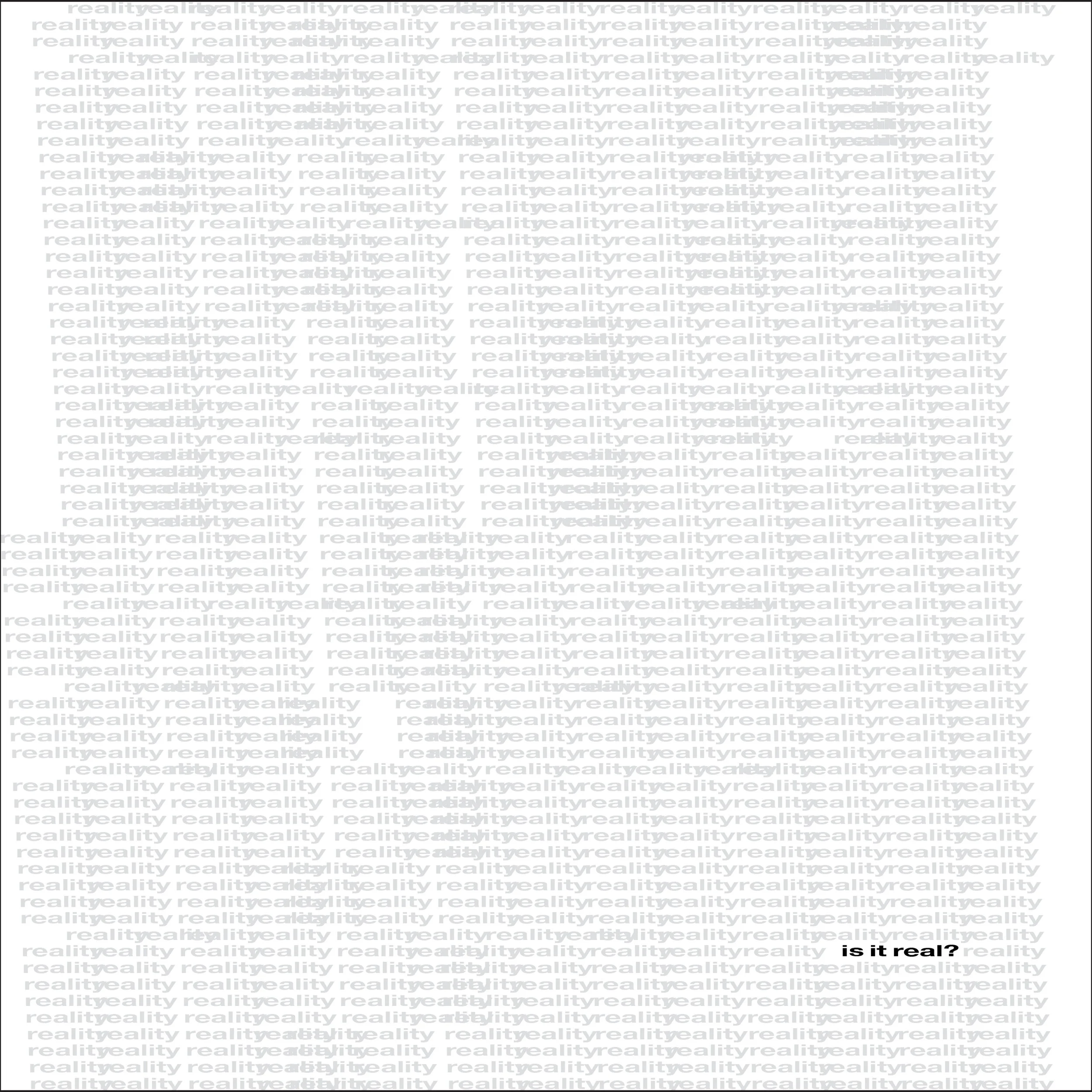
Create me a new entry in the main feed which then leads to a new page, and I want you to name it based on the description. Come up with a clever name for it. This page is basically going to be: when you land on it, it's just going to be a swarm of random words. Make it a lot of words, and I don't want them to be set up in any type of organized fashion. I want them to be moving around and changing sizes and all these things. Whenever you hover over a word or click on one (in the case of mobile), it changes to a different word. We're going to start there and see what it looks like.
love it. let's make it scrollable
the words aren't as dense now tho. we need that too
make it even more dense
split the difference
okay even less
lwt's go back to 420
call it Dreams gallery and make the image look more polished. it's decent but not great
no fig, just the words and the date. and make the words slightly less cryptic
Dreams gallery -> Dreams
maybe just Dreams
Dreams
the word needs to move more freely on murmur. like they're floating around the whole space
what was long stored, sent adrift (add long to the phrase)
Make the imagery look a bit more like a scientific drawing, like some type of blueprint. I actually do kind of like how it looks right now, but take what we have and take it a little bit more in that direction. Then write a very short one, just a phrase, that describes what the dream description was that I told you, but in a very cryptic way. And include the date of the entry.
Okay, cool, now let's add another entry to the feed that is going to be basically a visual sketchbook journal for my dreams. Every time that I have another entry, I'm going to tell you what the dream looks like or something, some visual thing from the dream. I want you to make a very stylized, sort of sketch-type drawing that symbolizes that. I want the style to be consistent for all of the drawings. For the first dream, I want you to make a floating garage full of childhood memories getting blown away to a distant land by a wind.
did we stop logging the changelog?
okay so when i forst loading the page it shows the load count, but then when i click reload it only shows a dash adn then words
instead of "Role" say "About"
we need to make sure everything on murmur loads smoothly both when entering the page and leaving it
needs to be as smooth as possible. maximally performant
/Users/aldenhuschle/Downloads/Alden\ Huschle\ Resume.pdf use this documents info to create a new page called Resume which will live directly above Changelog. Format it so that it fits the vibe of the site and looks very professional. the only thing I care about keeping intact from the PDF is the information, not the layout
can we get a little more creative with the layout?
okay now take this, remove the main head title and the description, and make the rest look more like a timeline
okay and elt's add Resume as a title
let's make it so that those types of titles don't condense to two lines unnecessarily on larger breakpoints
rewrite 1,200 miles, Magic is earned, and The aint-expert from the third person and make them a bit more broadly applicable to the world, not just me
no em dashes or unnecessary dashes
let's try all lowercase across the whole site
capitalize my name
revert back to where we were before going all lowercase
actually maybe i do like the lowercase
make sre "back" is lowercase too
remoe the arrow next to back
Use title case for, Email, Back, etc. and make sure the right label on each page is the ttile of th page. For example, should say the last questions, not design
but those labels should not be al lowercase
actually remove those labels they're unnecessary
increase the zie of the years/months on the resume timeline
capitalize the workplaces, comapnies in the resume
change email to contact
clean up the image in dreams, it's unclear where the frame is
create another image in the same style with two friends hunting in a meadow for a rabbit
take the following and create a new page called "bio" and make it a mock wikipedia page for me in the srtyle of the site that we've already built. find a way to make a subtle and obvious nod to wikipedia while retiaing our aesthetic. include the photo of me in this
the links don't take you to the right place in the article
remove "from the free encyclopedia" / the photo captio should read "Huschle in 2023"
move bio right above changelog
For the last questions and the debut solo album, I want to introduce a similar sort of optional clicking animation, similar to Spotify and Apple Music. The options will be: 1. The first one won't be an option; it'll say "Coming soon". 2. The second thing will be clickable, and it will say "About"
Since "Coming soon" is not clickable, I want it to be the same light gray color as the last question's title, and then make sure the bottom of the text isn't getting cut off. Right now, the bottom of the lower case g in "coming" is getting cut off at the bottom.
[Image #1]
Now that we have this sort of underlying structure of the murmur page, what I want to do is change the name of that to "themes". Instead of it just being a set collection of words, I want all the words to relate to themes that I am thinking about talking about or working with across my site. I wanted to look and act just as it does now, like all the moving words, the same amount of words, but I want them to be more specific to me and what is floating around my head.
Make sure words don't repeat. I see two large instances of structure.
I want the color of the "Coming Soon" text to be exactly the same shade of gray as the last question's title. Right now, it's a little bit darker.
The description of the debut solo album should be in the third person.
Don't use the word "he". Don't make it about the person; make it about the project, the work.
Just say, "While the Lyla Minor work was collaboratively arranged, considered, this is something more exposed. He started as a private practice and has slowly become something that needs to be heard. The songs arrive more than they were written." Skip the last sentence and then say, "No title yet, no release date beyond 2026."
Delete the first sentence and then make sure it's while the Lyla Minor work was collaborative, arranged, considered.
It started as a private practice of surrender
Remove the sentence the songs arrive more than they are written and then add it back on to the very last sentence but rewrite it as the songs are written as they arrive from beyond
Remove from beyond.
Replace the word "considered" with "negotiated."
On the copy for the anti-expert, change the word itself to a mirror.
Remove the last sentence.
I want the #1 AI and Wethos AI entries to just go right to the website. I don't want those to have an option to read the about page.
Let's try organizing the home page into three sections: Design, Music, and About. For the section titles, I want to use the same font and size that we're using for my name.
We'll also want to have one that says "Writing" or actually "Thoughts".
Small name with italic.
Dreams and themes should be in the "About" section, and then move The Last Questions to the top of the Design section.
Let's add another section titled "Other" that will live beneath "About". That will house Dreams, Themes, and Changelog.
Put Themes above Dreams.
Remove "of surrender" from the copy in the debut solo album about section.
Make the back button all lower case, and same with my name and contact.
Contact needs to be visible on all breakpoints. I don't want it to hide on mobile.
I want it to live to the right on mobile too. I don't like how it sits beneath my name.
Make contact lowercase and then make my name title case.
Let's actually make all the category names title case as well as the back button.
And what about the category names? Design, music, thoughts, about, and other. Those should be title case as well.
Okay, let's push these changes.
Okay, great. I'm struggling because I like the separation of the sections. It's almost necessary for someone that's visiting this that isn't me. But there was something nice about having all the main elements in a row without any separation. So I'm wondering if we could do something that satisfies both. We could use those funky brackets that would sit to the left, and then the titles would be rotated 90 degrees, so they're perpendicular to the main titles and labeled that way. It might not work, but I think it's worth trying.
Okay, that's actually not terrible. I kind of like it, but let's make it like the category titles. They're moving downwards when they should be up. We want to flip them so that they start moving upwards on the screen, reading from bottom to top, not top to bottom.
Actually no, that doesn't look as good. Let's revert back to what you just had, and then instead of the brackets living on the left side of the screen, let's allow them to live on the right side of the screen. This will allow us to have the left side of each item title all the way to the left of the margin, which looked better in the first place anyways.
I actually want to revert back to when the labels were separated in the section normally. I think it's a better experience for the user. The category labels.
Give 1200 miles the thought piece a different name based on the copy itself.
In the copy, change the first "moving to taking action" so it would be "the act of taking action", and then change "not because the destination" to "not because the destination or the outcome is necessarily".
Get rid of the little bracketed numbers and the word "edit" in the bio section. I get that they're supposed to make it look more like Wikipedia, but I just don't like how they look.
And get rid of the references section as well as the see also section.
Remove the software/products from the discography section.
Remove the discography section entirely.
remove Retrieved from "aldenhuschle.com/bio" — This page was last edited March 2026.
Sift through all the copy on the bio page and make sure there are no em dashes or unnecessary dashes used anywhere.
Remove the "AI insisted" part before "product design" in the second paragraph. Also include brand design in that list for that sentence.
text changes... romantic expertise -> instinctive mastery / anti-expert expert -> anti-expert
usea different font for the placement of my name that sits small above thr profile picture
I feel like we could go bigger with the text size for the primary titles for each project on the home page at the mobile breakpoint. They look good on other breakpoints, but on mobile they look small and there's definitely space for them to be a little bigger. Let's try it out.
Okay, but now the EP in Intermezzo's Volume One EP is not visible. We gotta make it so it's big enough where nothing gets cut off.
No, no, no, not on a separate line, never on a separate line.
I don't want the right side of any of the titles to go past the subtle line that lives beneath them. That sort of is what's acting as the margins of the page right now.
Let's revert back to what we had before I asked for the sizing change on mobile. I think it was better.
We need to access the history of the chat and revert back to what we had before I asked to increase the text size for the project titles on mobile breakpoints. I don't like the changes to be made after that.
Remove the line at the top of the footer.
i made changes t the copy in the bio. analyze the changes and make them reflect on the site. do not change anything besidee what i have changed: Alden Huschle is an American musician, designer, and creative technologist based in Long Beach, California. He is the lead designer at NumberOne AI, a California-based AI-first startup incubator, and an independent solo recording artist. Huschle's work spans music production, product design, brand design, and experience design. He embodies a creative philosophy that holds the technical and the spiritual as complementary rather than opposed, building with advanced AI tools professionally while maintaining an intentionally grounded music-making practice. He has described this sensibility as "romantic "expertise": the ability to intuit quality before being able to explain it analytically, a concept he connects to Robert Pirsig's distinction between romantic and classical modes of understanding. He is also the creator of The Last Questions, a web application designed around collective reflection. **CONTENTS** 1 Early life and background 2 Career * NumberOne AI * Creative philosophy * The anti-expert 3 Music * Early work * Debut solo album 4 Products and projects 5 Cultural commentary 6 Personal life ⠀Early life and background Huschle grew up in Snoqualmie, Washington. He studied design and played baseball at Seattle University, completing a Bachelor of Arts in Digital Design. During his Seattle years, Huschle was an active participant in the local music scene, playing in the band Lyla Minor alongside longtime collaborators. The Seattle period was formative on his worldview, particularly around creative collaboration, community, and dedication to craft. He later relocated from Seattle to Southern California to follow a relationship, a decision he has described as made on instinct rather than calculation. The experience became the subject of the song "1,200 Miles," named for the approximate driving distance between the two cities. ## Career **NumberOne AI (2024 – present)** Huschle joined NumberOne AI, an AI-first startup incubator, as a graphic designer in 2024. Over approximately two years, the role evolved substantially. He transitioned from traditional graphic design into agentic design, conceiving, designing, and shipping complete digital experiences end-to-end without formal engineering training. In this capacity, Huschle was responsible for the full visual identities of both NumberOne AI and its portfolio company WethosAI, including design systems, typography, art direction, copywriting, and custom web builds. **Creative philosophy** Huschle's creative philosophy rests on two core tenets articulated across interviews, project documentation, and his personal writing: *"Magic is earned."* Huschle uses this phrase to describe the quality that emerges through sustained, authentic creative commitment. He maintains a daily practice of rising before dawn to work on music for two to two-and-a-half hours every morning. He has described the creative process as "a war-like relationship with the creative spirit that ultimately resolves into channeling something beyond yourself." *The technical and the spiritual are not in conflict.* Huschle builds professionally with advanced AI tools while maintaining an intentionally AI-free music production process. He holds both practices without apology, arguing that this refusal of a false binary is both rare and increasingly relevant as AI democratizes technical execution. **The anti-expert** A related dimension of Huschle's identity is what he calls the "anti-expert." Operating without formal credentials in music or programming, he has reframed this not as a deficit but as a different and equally valid form of mastery. It's the ability to know what quality feels like before being able to explain why, the willingness to iterate through elimination, and the capacity to let the work lead. He has argued this form of expertise is increasingly valuable as AI handles more technical execution, shifting the premium toward taste, instinct, and vision. He has stated: "The enemy is the voice, internal and cultural, that tells people they are not qualified to begin." ## Music **Early work** Prior to his solo career, Huschle contributed guitar and lead vocals to Lyla Minor. The group performed around the Seattle area and released two projects: *Lyla Minor - EP* and *Intermezzos, Vol. 1 - EP*. **Debut solo album (forthcoming, 2026)** Huschle's debut solo album is a twelve-track record described as a "becoming album." Written and produced during a period of significant personal transition, including the move from Seattle to California, the evolution of his professional identity, and an ongoing reckoning with questions of love, faith, and creative purpose, the album represents a more exposed and personal body of work than the Lyla Minor recordings. The album is produced entirely by Huschle in an intentionally AI-free process. He has described this as a values statement: "The resistance to letting AI finish songs is about protecting the discoveries that only happen through struggle and iteration." Production takes place during early-morning sessions, typically two to two-and-a-half hours before the workday begins, a discipline maintained consistently throughout the writing and recording period. The album is slated for release in 2026. ## Products and projects **The Last Questions** The Last Questions is a web application designed around collective reflection. One prompt is published at a time; users write a response before they can read what others wrote. Once the community reaches a response threshold, the next prompt unlocks. Key mechanics include a "write before you read" system designed to prevent anchoring and preserve authenticity; a collective unlock model in which participation is a group effort rather than individual performance; invitation lineage chains visualized as arcs on a world map; and minimal opt-in public profiles. Huschle has described the philosophy: "To provide a refuge from reactive internet culture through thoughtful, pattern-level reflection." He has also noted its connection to his broader artistic practice: "Write before you read is the same instinct as keeping the music analog." As of March 2026, the application was described as approximately one to two weeks from shipping.
when i click the last questions, i then see coming soon and about, and then when i xclick about, as the page changes it quickly flashes back to the last questions. i don't want it to flash back to that. this is true for anywhere on the site where we have this type of transition animation in place
replace the image of the first dream with this image
great. and now the second dream with this image
hunting the hare
okay and let's try removing the border around the imags on dream page
reintroduce it but make it more subtle
replace the dream 2 image with attached
the contact should route to huschledesign@gmail.com
I re-wrote the copy for the "The Last Questions" about page. Please replace it word for word: most social products are built around ephemerality. scroll until you (maybe) find something interesting, move on. the last questions is built around the opposite instinct: sitting still as a feature, not a flaw. the core mechanic is simple. one prompt at a time. you write your answer before you can read anyone else's. the feed only opens after you've contributed something uniquely *you*. it's built for humans and agents alike. as ai becomes a more present participant in our social lives, the question of what authentic expression even means becomes urgent. the last questions is a space where the act of writing before reading (read: creating before consuming) restores something that most platforms have quietly eroded. in the final stages of development.
Delete the following sentences in the move first thought: Every meaningful thing ever built has followed some version of that pattern. Move first. Figure it out in motion.
Remove the following from the creative philosophy section of my bio:articulated across interviews, project documentation, and his personal writing:
In that same section, remove the quotation marks around "magic is earned".
delete: He has stated: "The enemy is the voice, internal and cultural, that tells people they are not qualified to begin."
In the Debut Solo Album (Forthcoming 2026) section of the bio, change "Becoming Album" to "Love Letter to a Period of Becoming". You don't need to capitalize any of it. Just all lower case.
Actually, let's do a love letter to young adulthood and include the word "a" that comes before "love" in the quotation.
delete: Production takes place during early-morning sessions, typically two to two-and-a-half hours before the workday begins, a discipline maintained consistently throughout the writing and recording period
In my bio, remove the cultural commentary section.
Also remove the personal life section.
Include my birthday, which is January 29th, 1998, in the section that houses my profile picture.
And then remove the website part of that section.
Add NumberOne AI and WethosAI in the associated acts section.
I'm not really liking the font that we're using in my bio section for the subheaders (early work, debut solo album, creative philosophy). Let's see if we can find a different font from our font set that will work instead for that.
Go for it.
Nah, I don't think that works. It doesn't pop enough.
That definitely doesn't work.
Yeah, let's explore that.
Go for it.
Nah, I don't think a serif is what we want here.
No, I want you to dig deep and find a retro font that is particularly well suited for subheaders. That is, it could be a sans serif, could be gothic, but not serif, and we want it to be a little bit heavier weight so it pops on this page.
Let's try option three.
That's not terrible, but it's not great yet. Let's see the option that you suggested at first.
Now I wanna try Russo 1.
That's not going to work. Let's go back to what we had just before this, and let's make it a little bit more light gray and maybe a slight bit smaller too.
Okay, we need to split the difference or something, go a little darker and a little bigger.
Okay, sides look good. Go a little bit darker.
Okay, and now on my resume page, anywhere there's a slash in the job title, I want that to be a thinner weight of the font than the rest of the text that surrounds it.
Okay, cool, and then for the two roles that were contract roles, move the contract label out of the subheader and move it into the job title in parentheses (lowercase), so it'd be brand designer (contract).
Okay, and then increase the size of the word "proficiency". Tighten up the letter spacing on that word, and change whatever the story needs.
In the proficiency item, whatever your story needs, change the word "your" to the word "the".
Okay, and then for the little favicon that shows up in the browser tab when people are looking at the site, can we just make it a circle that's the same color as the background of the site?
add this as a new dream entry. The dream took place on February 10th, 2026, and the caption should be undesired seating arrangement
okay, now this one for January 24, 2026, with the caption: culinary clutter.
now this for January 18th, 2026, with the caption "field mentorship".
Move the music section above the design section.
replace the cluttered kitcehn imagery with this
replace the seating arrangement image with this
move claude code ahead of cursor on proficiences
the hover animation doesnt work on bio, resume, and changelog
Okay, that works, and now the only options that don't have the hover animation are the ones that then open up to multiple options, such as Apple Music, Spotify, or Coming Soon. I kind of want those to have the hover animation, so let's try implementing that.
Make it so that the words don't change colors when they're hovered. Now that we have the animation, I don't think both are necessary.
Okay, and now when the Spotify, Apple Music, or Coming Soon About animation swaps in, it's a little glitchy. I think it's because we added that hover animation, so how do we smooth that out as best as possible?
let's remove the hover animation
okay and bring back the hover color changes from before
actually revert that
there's still a hover on apple music / spotify and about
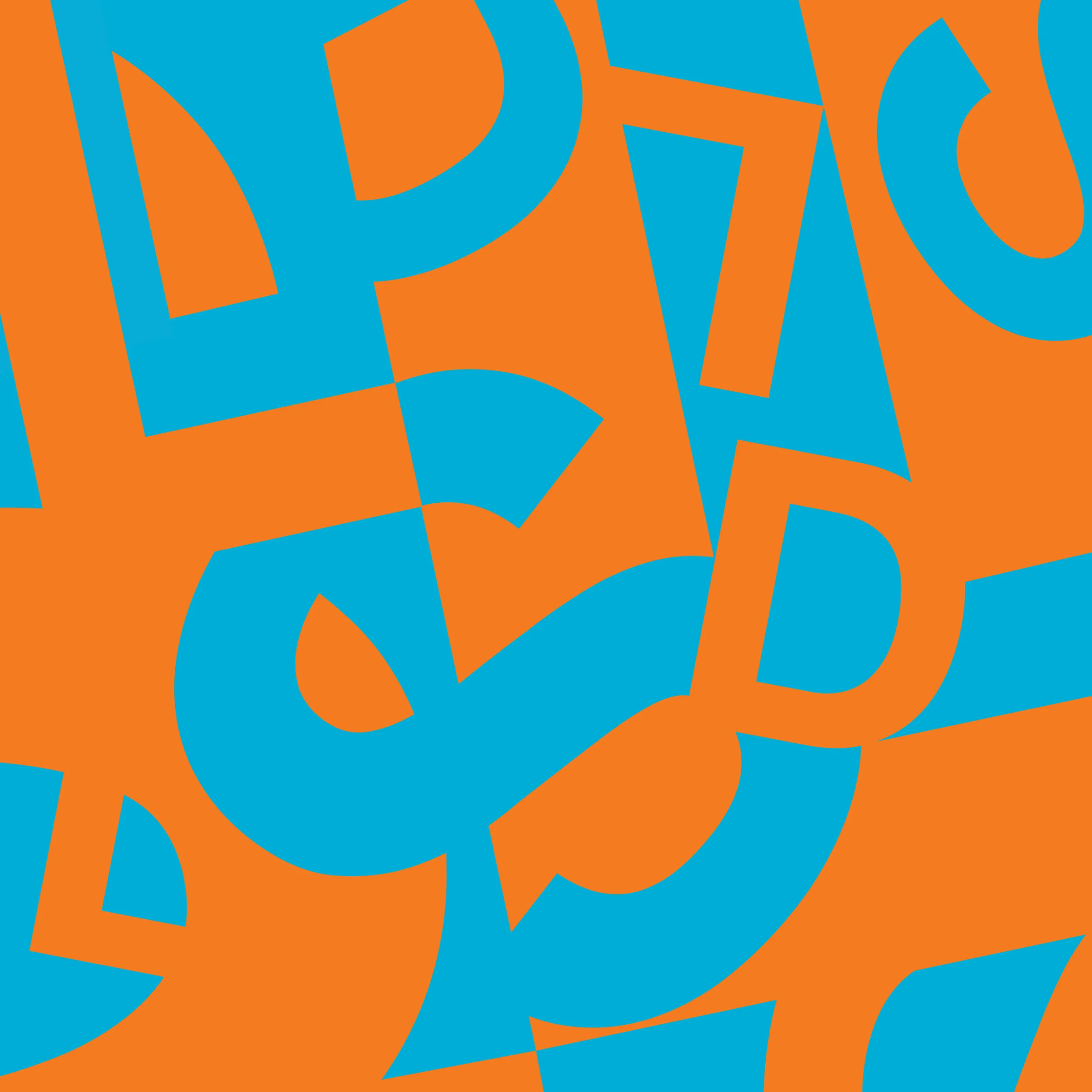
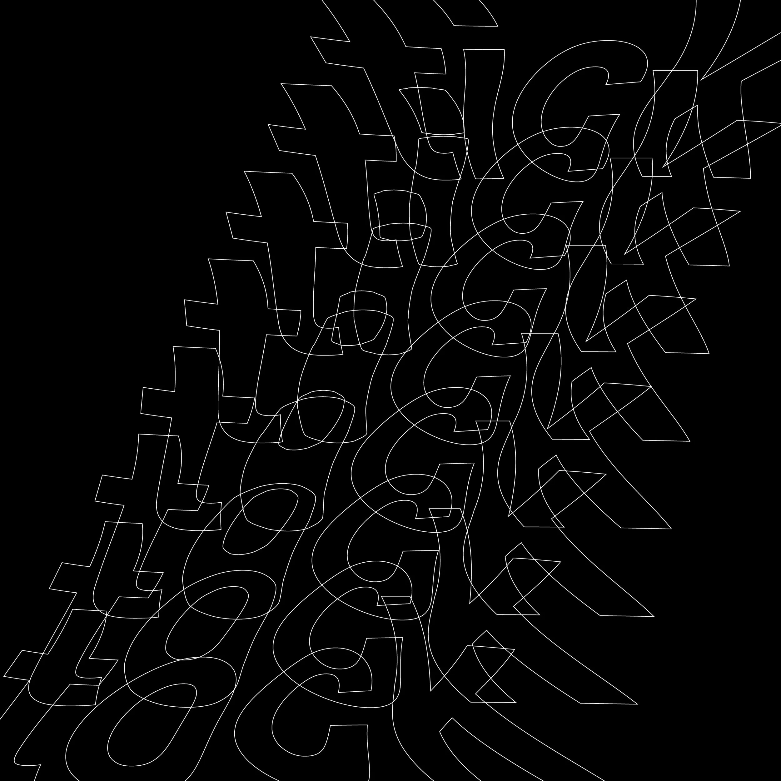
we need to make a addition to the design section at the bottom titles "gig posters" and include the attached images only problem is each of the posters is sitting ona a white background and they need to be cropped so it is just the posters
make it so the posters are larger and scrollable vertically one at a time
they're way too big now. they all need to be uniform in size, there needs to be a page title, and they shoukldn't exceed the margin width of other pages. use the thoughts pages as an example
there's still white around the edge of the green poster. it is not trimmed properly
okay and now we need to take this same approach and mak another page under the design section, beneath gig posters, titled "a house is not a home" with the attached images in order that they're named no trimming necessary this time
less vertical spacing betywen images
swap the order of the last and second to last gig poster
add a new dream to dreams. image attached. date 3/30/2026 and caption "a flight not taken."
So I want to change the name of the Last Questions project to Prompting People, and anywhere on the site where it is mentioned as the Last Questions, we need to change that to Prompting People.
Some of the copy describing Prompting People says it has questions, such as "one question is published at a time". We need to change all these instances to "one prompt is published at a time".
We wrote the copy from the Prompting People page. Please swap it in word for word: most social products are built around ephemerality. click and scroll until you (maybe) find something interesting, move on. prompting people is built around the opposite instinct: sitting still as a feature, not a flaw. the core mechanic is simple. one prompt at a time. you write your response before you can read anyone else's. the feed only opens after you've contributed something uniquely you. prompting people is a space where the act of writing before reading (creating before consuming) restores something that most platforms have mechanistically eroded. in the final stages of development.
unique to you -> uniquely you
quietly -> mechanistically
Okay, and now, for a house is not home, I'm going to throw a curveball at you. We need to actually take each page, and what I want to do is I want to display it as if you're looking at a book, because each of these pages is a book. What we need to do is take first one and actually move it to the end, and then, starting with two, we should be looking at a full spread like a book. The best-case scenario would actually be that you could sort of flip through it and have it even animate like a book, but basically we will want a full spread. On mobile breakpoints, we will actually want there to be a little thing that tells people to turn their phone sideways, because I really want them to be able to flip through. This is meant to be a book-like experience, and for this specific component, because the two images next to each other are going to be somewhat wide, I'm okay on the larger breakpoints with us breaking this sort of width rule for the margin that we've been using elsewhere. This is an exception for that rule.
Okay, instead of it just transitioning two pages at a time, is there any way we can make it look like a page is turning, like an actual page?
Okay, now that I'm seeing it like this, maybe the last page does actually need to be the cover. In that case, we'll have to figure out how to make that look good, because the cover isn't going to be a full spread.
Okay, but it still is the last page of the book, so we need to bring that to the front.
Okay, what if instead of doing the enlarged thing at the beginning, we kept it wide? Obviously, at the start you would see the cover on the right side, and on the left side we have an icon, a gesture icon for a swipe, which would be intuitive on mobile breakpoints. On desktop, what if hovering your mouse over the book creates a swipe effect so you can sort of swipe through the pages with your mouse? Those arrows at the bottom wouldn't even be necessary.
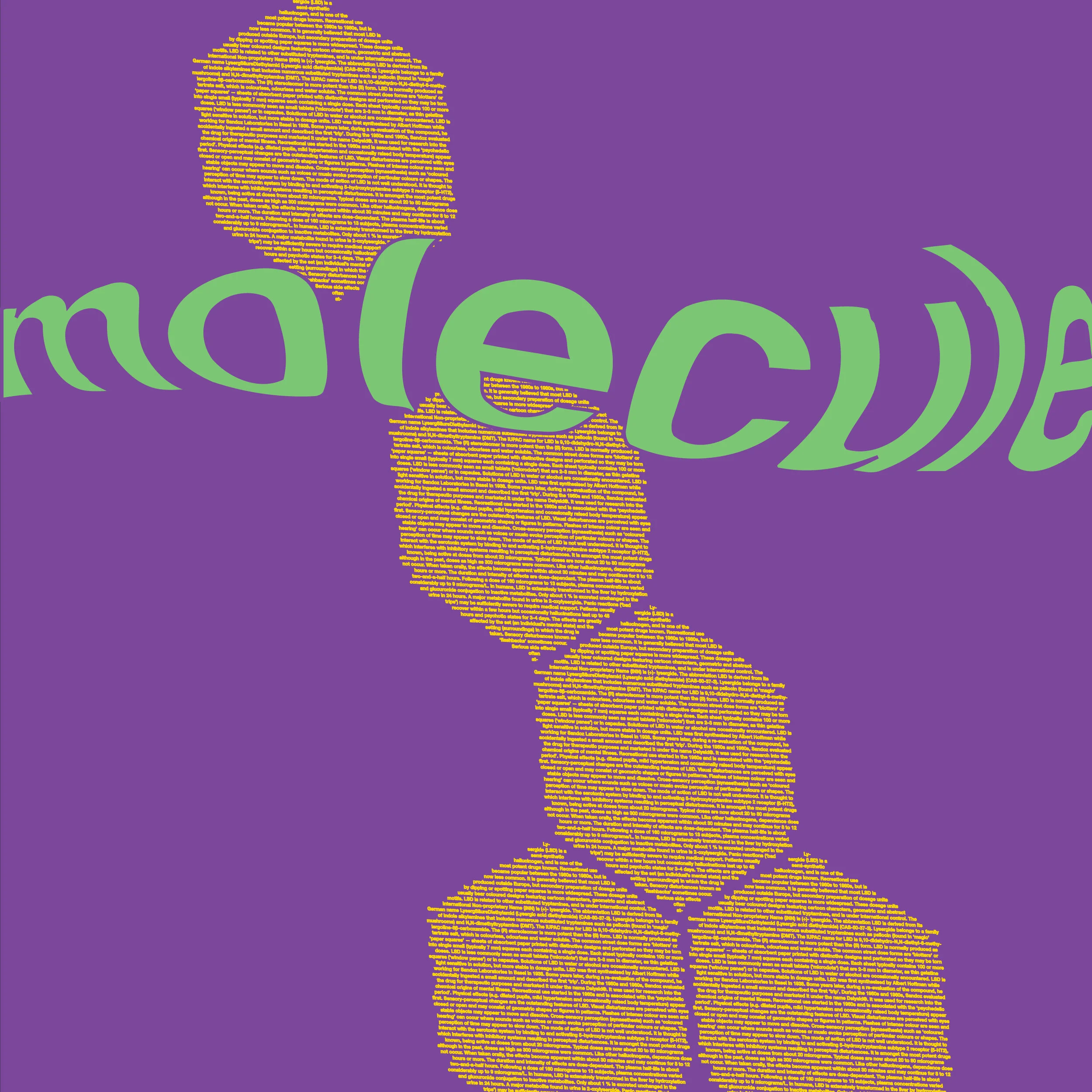
okay, so now we need to create a new entry in the design section titled "Molecule". I've attached four images, and these four images need to be displayed as art pieces, but they represent LSD. I want them to be displayed in a way that sort of plays nicely with the trippy, psychedelic nature of LSD. I'm open to suggestions on what that might look like, but I want it to catch people off guard.
Okay, I like the color. I don't like the hover effect that kind of makes it a little larger. Let's remove that and then let's use just our standard background that we use across the site for this.
So I'm down to do something different with the background. I just didn't like the flat purple color. How can we just really make it crazy looking? I want to just completely make people go 'whoa'. It doesn't have to look pretty or anything; it can look messy. I just want the whole background to be like a splatter of craziness and different colors and movement. I want it to be performant, of course, but I just want it to be wild, and then the whole art piece should be a little bit smaller, I think too.
Okay, wow that actually looks really bad. I don't like that at all. We need to revert back to the standard background. And then I actually want to take each of the four sides of this image and I want to make a 3D cube that users can rotate around and see the different sides of the art piece. And I want to get rid of the morphing colors, actually no, let's keep the morphing colors and let's amp it up a bit. I want them to change a bit more drastically.
The cube is not rendering properly. All I see is one side rotating, but actually it kinda looks cool that way. Maybe we stack all four sides so that there are four of these rotating 3D art pieces. They're all rotating, and if the top one is rotating clockwise, the one beneath is rotating counterclockwise, and so on.
They need to rotate much slower. Like, very slow.
Swap the placement of the third and fourth ones.
We need to have a page title on this page.
Why is it so far off to the left? It should be consistent with the other placement on the website.
Now, on the other places of the website, it's much more centered. Perhaps left-aligned in the margin, but it looks way more in the center of the page, and that's what I want it to be on this.
do you see how it's still way off to the left?
Okay, and now I'd like to try something actually totally different: "A house is not a home." Instead of making it a book, I want to connect all of the images into one long horizontal image and allow that to essentially be like a scroll bar, like an image scroll feed, but horizontally, and you can just scroll from one side to the other. I want it to look like all one big horizontal picture. I think it's going to be awesome.
It's showing up way, way, way too big, and there's no page title.
push changes
remove the vertical spacing between the 4 images on molecule, and remove the black outline around the bottom white one
now offset the starting angles of each image so that they progress ina way that makes the stack look like a rotating spiral
yeah but there are two paits that are spinning at the same angle. I want them all to be different so it ends up looking like a spiral staircase
okay and remove the black outine from the bottom image
nice, now can we add a bit of 3D depth to each image so it doesn't look completely flat? just a bit of depth will do
you leaned them. I wanted you to make them look more 3D as in make them look like thin slices of cubes. not leaned
nop they still look flat and 2D
i actually don't like this. let's revert back to the tilt but let's make them alternate the way they tilt
cool. now for house is not a home, we need to adda a subtle swipe icon (no text) and we need o turn it sideways on mobile and add a rotate phone icon (again, no text)
you should be able to see the art piece turned sideways on mobile. and that rotate phone icon is not good enough
okay maybe we don't have the rotate capability. bet let's make the image a littler bigger on mobile
remove the color changing on molecule. keep it the OG colors
okay and make sure the animation on that page is as smooothe as possible. no glitches ever
only the first two images are rendering now
okay and eliminate any vertical space between the images
replace the swipe animation with the attached icon. place it to the right of the house is not a home title
needs to be larger and a little closer to the title
actually remove the icon. let prople figure it out on their own. also, on mobile breakpoints, this title cannot break into an orphan line
cool, and then on mobile let's make the art piece larger
okay and bring back the original swipe animation
make it move smoother
push changes
I have a new thought entry. We'll title this one "you always know" - indecision is rarely the absence of a preference. somewhere beneath the noise of other people's opinions and the fear of being wrong, there is already a direction. most people can feel it, even when they refuse to name it. the hard part is not figuring out what to do. it is finding the nerve to admit that you already know.
Place it at the top of that section since it is the newest.
Okay, now I'd like to try something with the bio section. We have this stylized as kind of in the style of a Wikipedia page, but we're using the style of the website and sort of making that into a Wikipedia page. What I'd like to do is run a web search to figure out exactly the style that Wikipedia pages are made from fonts and everything, and then recreate that page as it stands right now using those styles. I want someone to almost think that they accidentally clicked on a Wikipedia link when they click that.
The page is showing up blank when I click on the new thought "you always know".
Okay, next we're going to try something kind of funky on the resume page. Right now it's just listed out very, very sort of generic and in the style of the site. What I'd like to do instead is use a different color background. I want the resume to look as if it was written on a tombstone, a tombstone that you scroll down to read. It's okay if it's a long tombstone, but make the font and everything look like a tombstone and make it look three-dimensional.
The shape kinda looks like shit, and I don't like the fonts you chose, and the texture does not look like a stone. Let's fix all those. I want the font to be a little bit more old English-y. Really make this look like an ancient tombstone.
this looks far too beginner. It needs to have some level of depth to it, and you definitely need to be able to read all the text. Maybe let's rethink the approach we're taking and make sure we nail the depth and the legibility to begin with.
Okay, that's better in terms of the legibility, but the shape of the tombstone itself still just looks weird to me. Can we run a web search and find if there are any components online that we could pull directly or pull some inspo from? Think about this more in terms of a video game. It should look almost secure in a cemetery. It's fine to have the black background, but the tombstone itself should look like you'd find it in a video game, like it has that level of sophistication and depth.
okay that's better. let's now make the text look as if it is etched into the stone and let's find a more legible old english font
use UnifrakturCook on google fonts
actually maybe IM fell english. and all the text needs to look etched in. make it more subtle tho, it shouldn't look like a drop shadow. also, mak te stone textexture much more granular and add subtle cracks to it
remove the cracks and make all the text black. also, go back to the last font we had
okay now made all the text look etched into the stone while keping it black
that looks like it protrudes out, not etched in
let's make the shape at the top more complex and ornate. then make it so it all looks like one hape, right now there's a separating line where the top semi circle begins
that looks horrible. run a websearch and find ornate shapes for tombstomnes and pcik your favorite. also, there's still seapration between the shapoes. fix it
revert back to the circle shape, this looks awful. and the shape is STILL not all one shape. the tombtone should be all one shape with a rounded top!!
now that it's finally all one shape, move the text up so that the name sits closer to the top of the tombstone
a little further down
okay and then make it so the bottom of the tombstone sits on the bottom of the page
when i scroll past the extend of the page, the background should remiain black. right now it's white
nop it's still white on the overscroll and there's white at the bottom of the base of the tomb even before the overscroll
overscroll is still white. is this because i'm viewign lcoally?
okay. make the subtle ornamnets on the lines of the tombstone the same color as the lines they coincide with
still looks fsint white
make them solid dark, same color as the text
actually just remove them
increase the text size for the years and proficinces
change musician to something design related for the sebtitle on the tombstone
put whatver the story needs on its own line, and change audio production to art direction
move UX/UI down a line
move brand in brand design down a line
can we add some pixelated flowers at the bottom of the tombstone>
no i mean like at the base of the tomstone, sprouting upwards around it. colorful and minecraft esq
the tombstone needs to be brighter. it's a bit faint right now
okay and move all the text up a bit higher
rvert that change and add some type of cool engraved pattern to the space above the text, something symbolic
okayI like that!@ let's make it larger and decrease the vertical space between the bottom of it and my name
okay now imagine the text and the symbol are grouped together. move the whole thing down a bit on the tomstone
The tombstone visual is still coming across as fairly dim. I think the rock itself needs to be a little bit brighter so it lightens up the whole page.
That's better, and then I think we need to find a different font to use for the old English font. This one is just not working for me anymore.
I want to stay with an old English font, not like a swoopy serif.
That one is interesting, but still not right.
you pick
Okay, that's fine for now. Let's make the visual symbol at the top of the tombstone a little bit smaller and create a little bit more space between the bottom of that and the top of my name.
Now there's too much space between those elements.
Still a bit too much. Maybe leave my name where it is and move the circle symbol down a bit.
Now can we try taking this whole tombstone with the text included and make it so it's rotated a little bit so you can really see the 3D dimensionality of it, but make it so you still see and read the text on it?
interesting. make it look thicker
revert the last change
and the change before it too
Okay, now when I click the back button, all I see is a blank white page.
let's veret back to the resume page before we made it a tombstone
okay and let's revert the wiki bio back to the stylized version too that matches the rest of the site
make sure paragraphs have line spcesbetween them
change you always know to you already know
push changes
new thought entry titled "prisms" - artists will often speak of channeling, of receiving something from beyond themselves. what gets less attention is the transcription that follows. energy arrives as feeling, as unconscious knowing, and then moves through the body, through every experience and instinct that has ever been. it is through this process that we arrive at the output we recognize as creation. we are not the windows light passes through, but rather the prisms that expose its color and radiance.
should live above you already know
new dreams entry for april 2, 202. caption needs to suggest in a cryptic way that the image is of two friend swho intentiaonally staryed a forest fire
okay push changes
on bio, make it so there is a separate creative philosophy section
take the first paragrah of the creative philosophy section, add it to the first overall paragraph, and remove the rest of the copy. that's all we need
break the opening into the two separate paragraphs and delete the rest of the bio
remove "american"
remove wethosai and numberoneai sections from the site
copy edits to prompting people page: most social products are built around ephemerality. click and scroll until you (maybe) find something interesting, move on. prompting people is built around the opposite instinct: sitting still as a feature, not a flaw. the core mechanic is simple. one prompt at a time. written by humans for humans. you write your response before you can read anyone else's. the feed only opens after you've contributed something unique to you. prompting people is a space where the act of writing before reading restores something that most platforms have mechanistically eroded. in the final stages of development.
copy edit for prisms: artists will often speak of channeling, of receiving something from beyond themselves. what gets less attention is the transduction that follows. energy arrives as feeling, as unconscious knowing, and then moves through the body, through every experience and instinct that has ever been. it is through this process that we arrive at the output we recognize as creation. we are not the windows light passes through, but rather the prisms that expose its color and brilliance.
copy changes for you already know: indecision is rarely the absence of a preference. somewhere beneath the noise of opinions and the fear of being wrong, there is already a direction. most people can feel it, even when they refuse to name it. the hard part is not figuring out what to do. it is finding the nerve to admit that you already know.
copy edit for anti expert: there is a form of expertise that has nothing to do with formal training. it comes from something closer to devotion: the ability to know what good feels like before being able to explain why, and the willingness to sit with something and chisel away until a mirror is revealed. that is a different and equally valid form of mastery.
copy edit for magic is earned: there is magic that exists in this world. it reveals itself through relentless dedication to craft, to honesty, to whatever form love takes in the work. the technical and the spiritual are not in conflict. the people doing the most interesting things tend to hold both without flinching and without needing to reconcile them. each makes the other more real.
editf or move first: some distances aren't about the miles. they're about the decision behind them, made on instinct rather than calculation, where the act of taking action proves what planning never could: that feeling can be trusted as much as logic. not because the destination or the outcome is necessarily better, but because the leap itself reveals a capacity for self-trust that most people never test. / also change title to the leap
copy edit to bio: **alden huschle** is a musician, designer, and creative technologist based in long beach, california. he is the lead designer at numberone ai, a california-based startup incubator, and an independent solo recording artist. his work spans songwriting, music production, product design, and brand design. he holds the technical and the spiritual as complementary rather than opposed, building with advanced ai tools professionally while maintaining an intentionally grounded musical practice.
add hyperlinks to "wethosai" and "numberone ai" in the first entry copy of the resume section. i want peple to be able to access the sites therer
swap out the image on the latest dream entry / also change the caption to "setting fire to pine"
more replacement images. file names should help you figure out where to put them
again
try again now
another
hunting hare
seating arrangement
field mentorship
new one for flight not taken
revert change. Change the caption on "undesired seating arrangement" to "seating derangement".
add a new dream: caption "manual guillotine"
new image for that last one
new copy for debut solo album about: while the lyla minor work was collaborative, arranged, negotiated, this project is more exposed. what started as a private labor of love has slowly taken shape into a body of work that needs to be heard. no title yet, no release date beyond 2026. the songs are written as they arrive.
add a hyperlink to lyla minor in that copy and link it here: https://music.apple.com/us/artist/lyla-minor/1753837557
wait. the hyperlinks in teh resume section are purple. I like teh style you just applied to the lyla minor link
okay and now push everything and make sure you correct any mistakes from pushing before. we are going to be going live with this site
Okay, now I need your help getting this pushed live. I have the domain, and I can provide any information from the DNS. We have it on GitHub, so if we can publish live from GitHub, great. If we have to put it somewhere else, we can do that too.
when I click into a page, let's say one of the thought pages. When I hit the little back button that we have in the UI, it's a smooth transition, but when I click the back button in the browser, there's sort of like a vertical jump in the page that is not the greatest looking.
Okay, I'm now looking at this on mobile now that it's live. When I click into a page and then click the back button in the browser, all it shows me is a blank white page. It doesn't take me back to the home page. I have to actually reload the page for it to show.
We need to make sure that a house is not a home. The image scrolls really smoothly on mobile. Right now it's like it jumps around in a pretty glitchy kind of way. We wanted to feel like a smooth scroll that people can do with their fingers.
Okay, I'm still running into the issue where, when I click Back from being in a page, it doesn't load anything. It just takes me to a blank page. We need to fix this immediately.
It's possible that the GitHub changes just haven't loaded into effect yet, or perhaps something is cached in the browser, but I'm still running into this issue. When I click onto a page, for example, when I click into a house is not a home, and then when I click back, I am confronted with a blank background until I manually press page reload; then the home page reloads. We need to fix this. This is a terrible web experience.
Okay, and then for options where I click on something and then it shows me, let's say, as an option. When I click on "About", there is a gray rectangle that seems to appear on the click. Is that something that we can control, or is that out of our control of the browser? If we can control it, I'd prefer that that is not there.
update to copy on debut solo album: while the lyla minor work was collaborative, arranged, negotiated, this project is more exposed. what started as a fragmented labor of love has slowly taken shape into a story that wants to be told. no title yet, no release date beyond 2026. ~13 songs, welcomed and nurtured as they arrive.


there is magic that exists in this world. it reveals itself through relentless dedication to craft, to honesty, to whatever form love takes in the work. the technical and the spiritual are not in conflict. the people doing the most interesting things tend to hold both without flinching and without needing to reconcile them. each makes the other more real.
alden huschle is a musician, designer, and creative technologist based in long beach, california. he is the lead designer at numberone ai, a california-based startup incubator, and an independent solo recording artist.
his work spans songwriting, music production, product design, and brand design. he holds the technical and the spiritual as complementary rather than opposed, building with advanced ai tools professionally while maintaining an intentionally grounded musical practice.